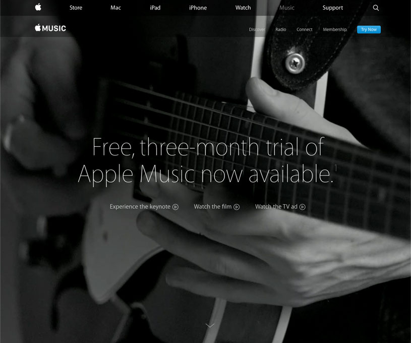
I love Apple's new website, its expression, the mixture of different layers giving the feeling of multiple dimensions. I like how they break outside the normal structure, Bootstrap-like page - strip of header on the top with logo and links, etc. - and add full viewport video, and animated/still photos. On top of them they place semi-transparent characteristic white/black strips, that contain the links to the subpages.

apple.com’s music page
And it’s not an easy goal to achieve. The different layers should be in the right contrast, that the text can be still legible; the underlying dimensions should be animated enough to attract attention, but not distract.
But at the end, does it really matter? Does the normal user enjoy all that fuss? Do they even notice it? Or is the target audience the designer or the design-oriented fans? Many questions, with answers important for all websites that wish to go Apple’s way.